
Internal
Style guide
Every colour, type size and component used on this site, in one place. This page is not linked from the main navigation and is excluded from search engines.
Colour
Seven named colours plus four tinted grounds. Components never use a raw hex value — every colour below is a CSS custom property declared in globals.css.
Brand
- #6A2323
Burgundy
--color-burgundy
Primary — sampled from the crest.
- #943131
Burgundy bright
--color-burgundy-bright
Hover state for primary.
- #451414
Burgundy deep
--color-burgundy-deep
Dark sections, footer, table heads.
- #2C0B0B
Burgundy ink
--color-burgundy-ink
Deepest. Text on gold.
Support
- #1E4E8C
Blue
--color-blue
Upper Primary. Secondary links.
- #14355F
Blue deep
--color-blue-deep
Dark blue sections.
- #17726A
Teal
--color-teal
Lower Primary. Success states.
- #F2B138
Gold
--color-gold
The star. Accent, CTA band.
- #8A5B00
Gold deep
--color-gold-deep
Gold that passes AA on paper.
- #A31D2F
Danger
--color-danger
Form errors only.
Grounds
- #FFFFFF
Paper
--color-paper
Default page background.
- #EAF0F9
Mist
--color-mist
Pale blue tinted section.
- #FBEFEF
Blush
--color-blush
Pale burgundy tinted section.
- #FDF6EC
Sand
--color-sand
Pale gold tinted section.
- #E8DCDC
Line
--color-line
Hairline borders on paper.
Text
- #211313
Ink
--color-ink
Body text. 16:1 on paper.
- #5E4747
Ink soft
--color-ink-soft
Secondary text. 7:1 on paper.
- #705C5C
Ink faint
--color-ink-faint
Dates, counts, captions. 5.3:1 on mist.
Contrast rules
- Gold is never used for small text on paper — use gold-deep, or gold on a dark ground.
- Ink-faint is for meta text — dates, counts, captions — and passes AA on every ground the site uses, including mist and blush.
- Every dark section uses paper at 100% for headings and paper/75–80% for body copy.
Type
Two families, four weights in total. Bricolage Grotesque (700, 800) for display; Instrument Sans (400, 600) for everything else. Both are self-hosted through next/font and subset to Latin.
display-1
Hero headline only. One per page.
Train up a child
display-2
Page H1, CTA band headline.
Train up a child
h1
Section headings.
Six things you can check
h2
Sub-section headings.
Curriculum and assessment
h3
Card and block headings.
Guided reading in sixes
h4
Small card headings, labels.
Class sizes capped at 22
lead
Standfirst under a heading.
Classes capped at 22, and reports that tell you the truth.
body
Default paragraph.
The quick brown fox jumps over the lazy dog, 0123456789.
small
Card copy, form labels.
The quick brown fox jumps over the lazy dog.
fine
Meta, captions, hints.
The quick brown fox jumps over the lazy dog.
Buttons
Variants
Sizes
On a dark ground
Every button is at least 44px tall at md and above, and carries a visible gold focus ring. Button text names the action — Book a campus tour, never Submit.
Form fields
Every field has a real <label>, a stable id, and wires its error message to the input with aria-describedby and aria-invalid. Live examples are on the contact page, the tour form and the four-step application.
- Text, email, tel, date, number
TextField - Multi-line
TextArea - Single choice from a list
SelectField - Multiple choice
CheckboxGroup - One of a few
RadioGroup - Consent
ConsentBox - Spam trap
Honeypot - Submit with pending state
SubmitButton - Success / error banner
FormMessage
Small pieces
Eyebrow
Why parents choose us
Visit us
Sentence case, led by a gold star. Never tracked-out uppercase.
Pills
- Notices
- Junior High
- Most enrolled
- Places available
- Full time
Star and rule
Breadcrumbs
Counters
700+
Counts up once on scroll; renders the final value without JavaScript.
Decorative accents
Always aria-hidden. One or two per section, never more.
The mark
The school’s crest — a quartered shield carrying a book, an abacus, a torch and a pencil, over a ribbon reading “Train up a child”. Supplied as artwork and used as an image rather than redrawn: tracing a crest by hand always loses something, and at the sizes used here a PNG is smaller and more faithful.

lockup.png
Full lockup, for print and documents

shield.png
Header, mobile menu, light grounds

shield-light.png
Footer and any burgundy band

icon-512.png
Favicon, app icon, social card
Rules
- Always render the mark through
LogoMarkorLogo. Do not reach for the file directly. - Burgundy crest on light grounds, white crest on burgundy. There is no third variant.
- The wordmark beside it is typeset, not part of the artwork — the supplied lockup’s own wording is illegible at header height.
- Never recolour the crest to gold, and never place it on a photograph without a solid panel behind it.
Icons
Drawn in-house at 24×24 with a 1.7 stroke, so weight and corner radius match the rest of the design. No icon library is downloaded at runtime.
- class-size
- curriculum
- reading
- ict
- safeguarding
- teachers
- bus
- meal
- clinic
- clock
- calendar
- cedi
- document
- download
- phone
- pin
- sport
- music
- art
- chat
- shield
- search
- check
- users
- globe
- lab
Cards and surfaces
tone=“paper”
Hairlines and tinted grounds do most of the work; shadows are used sparingly and are always tinted burgundy, never neutral grey.
Read moretone=“mist”
Hairlines and tinted grounds do most of the work; shadows are used sparingly and are always tinted burgundy, never neutral grey.
Read moretone=“outline”
Hairlines and tinted grounds do most of the work; shadows are used sparingly and are always tinted burgundy, never neutral grey.
Read moretone=“burgundy”
Hairlines and tinted grounds do most of the work; shadows are used sparingly and are always tinted burgundy, never neutral grey.
Read more
Image masks
The arch is the signature shape — a doorway rather than a generic blob. Three masks cover the whole site.
mask-arch
Portraits, hero images, feature photographs
mask-arch-soft
Wide collage images
mask-leaf
Thumbnails, news cards, secondary images
Placeholder artwork
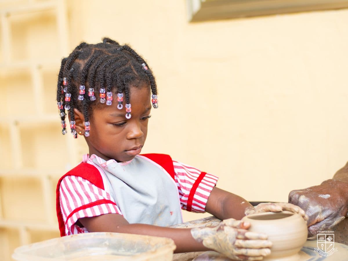
Every photographic slot is registered in content/images.ts with alt text, aspect ratio and the shot required. Until a real photograph is supplied, the slot renders deterministic on-brand artwork captioned with the shot needed — so nothing is ever broken, and replacing a placeholder never shifts the layout.


Accordion
No competitive entrance examination. Children applying for Basic 1 and above sit a short placement assessment so that we place them correctly.
Yes. We agree instalment plans with any family who asks in writing before the term begins.
No. No member of staff may strike a child for any reason.
Carousel
CSS scroll-snap does the scrolling; JavaScript only adds the arrows and keeps their disabled state in sync. No carousel library, no autoplay, and it works with JavaScript switched off.
01
Scroll-snap item 1.
02
Scroll-snap item 2.
03
Scroll-snap item 3.
04
Scroll-snap item 4.
05
Scroll-snap item 5.
06
Scroll-snap item 6.
Data table
| Class | Cap | Adults |
|---|---|---|
| Basic 1 – Basic 3 | 22 pupils | Teacher + assistant |
| Basic 4 – Basic 6 | 24 pupils | Subject teachers |
| Basic 7 – Basic 9 | 25 pupils | Subject teachers |
Wraps in its own horizontally scrollable, focusable region so a wide table never makes the page scroll sideways on a phone.
Marquee
- Train up a child
- Faith
- Resilience
Pure CSS on a duplicated list; the second copy is hidden from assistive technology. Pauses on hover and stops entirely under prefers-reduced-motion.
Section grounds
Alternating grounds are what give a page its rhythm. Every band on the site goes through the Section component rather than styling its own background.
- paper
- mist
- blush
- sand
- burgundy
- blue
Home page order: blush → paper → mist → burgundy → paper → sand → paper → blush → burgundy → paper → gold → burgundy.
Motion
The signature moment — hero, on load
The headline rises line by line while the arch-masked photograph opens from a small doorway to full height, and the star cluster settles last. Pure CSS, so there is no JavaScript on the largest-contentful element. Runs once.
Everything else — quiet
A short opacity-and-translate reveal on scroll, once, via
IntersectionObserver(about 1KB, chosen over an animation library to protect the JavaScript budget). Stat counters count up once. Hover states are 200ms colour and shadow transitions.Reduced motion
A global rule in
globals.cssreduces every animation and transition to 0.001ms. The reveal renders instantly, the counter shows its final value, and the marquee stops.
Accessibility rules
- One <h1> per page, and heading levels never skip.
- Skip-to-content link is the first focusable element on every page.
- Focus is a 3px gold outline with a 3px offset — visible on light and dark grounds alike.
- Every interactive target is at least 44×44px.
- Colour is never the only carrier of meaning; status pills carry text as well as tone.
- Decorative SVG is aria-hidden; meaningful images carry real alt text from content/images.ts.
- Modal dialogs (mobile menu, lightbox) trap focus, close on Escape and restore focus on close.
- Carousels are labelled scrollable regions and are keyboard-reachable.
- Form errors are announced through aria-describedby, and status banners use role="status".
Content lives in /content
Every name, number, date and price on this site is in a typed data file under /content. No component contains a fact.